By Danny Kaplan | April 25, 2019

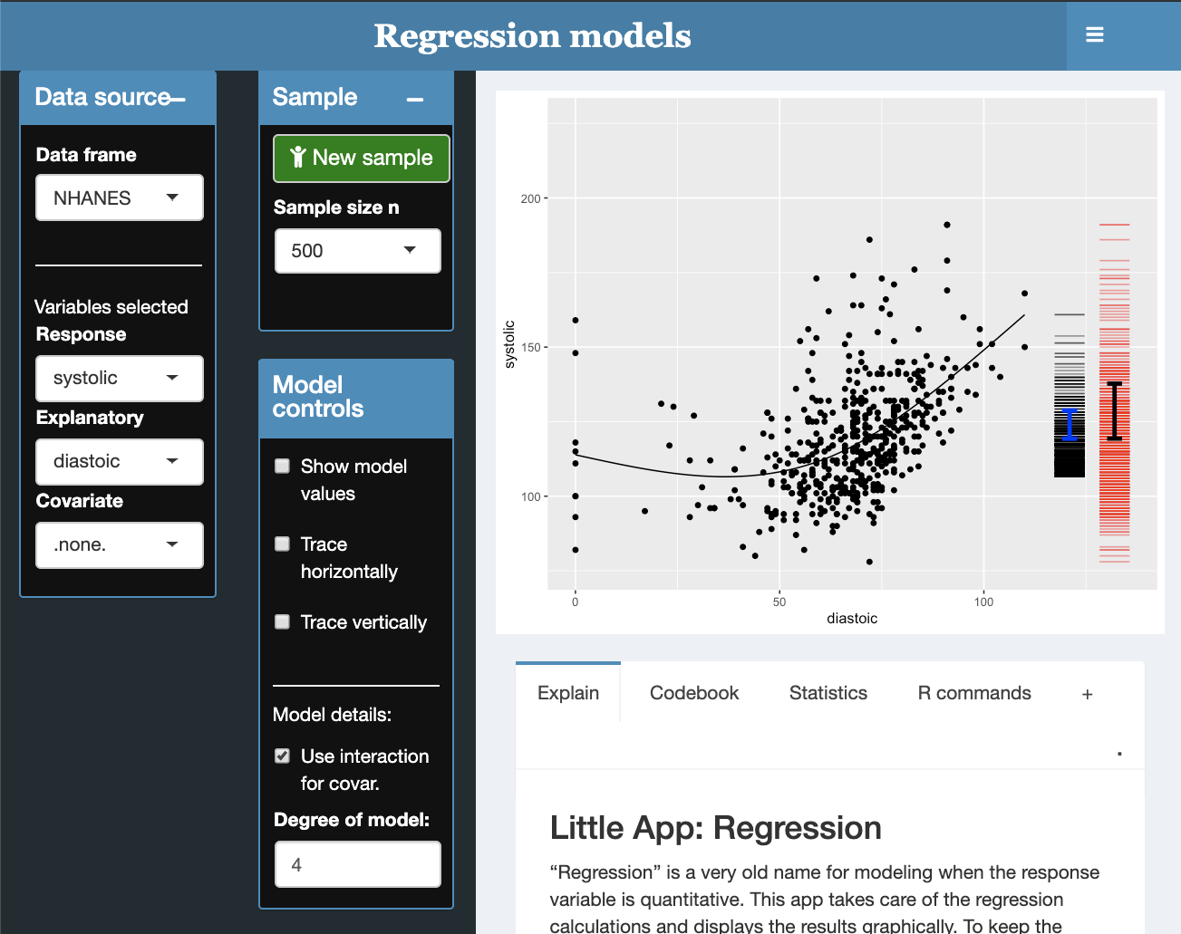
The linear regression Little App displays a jittered point plot of two quantitative variables. Upon this is layered two annotations:
- A regression model. By default this is simple linear regression, but you can also incorporate a covariate and add curvature to the model.
- Two sets of short horizontal bars to the right of the graph, together with an interval showing the standard deviation. At first, this display may be unfamiliar. The red bars show the vertical position of each of the values of the response variable. The black bars show the vertical position of the model values, that is, the output of the model for each of the displayed points. The ratio of the standard deviation of the model values to that of the response variable gives \(\sqrt{R^2}\) (or, stated more sensibly, \(R\)).
- Easily incorporate a categorical covariate into your model.
- Explore robustness by selecting new samples from the population.
- Estimate by eye r and R2 from model-value display.
- Measuring stick to support reading values and differences off the graph. For instance, measure the “rise” of the model over a given “run” to find the slope of the regression line.
- Statistics tab shows r, R2, p-value statistics along with regression and ANOVA tables
- Can add curvature to the model (using natural splines) to explore nonlinear relationships.
Suggested StatPREP 101 activities
comments powered by Disqus
