By Danny Kaplan | April 16, 2019
Births_2014. Click here to launch.
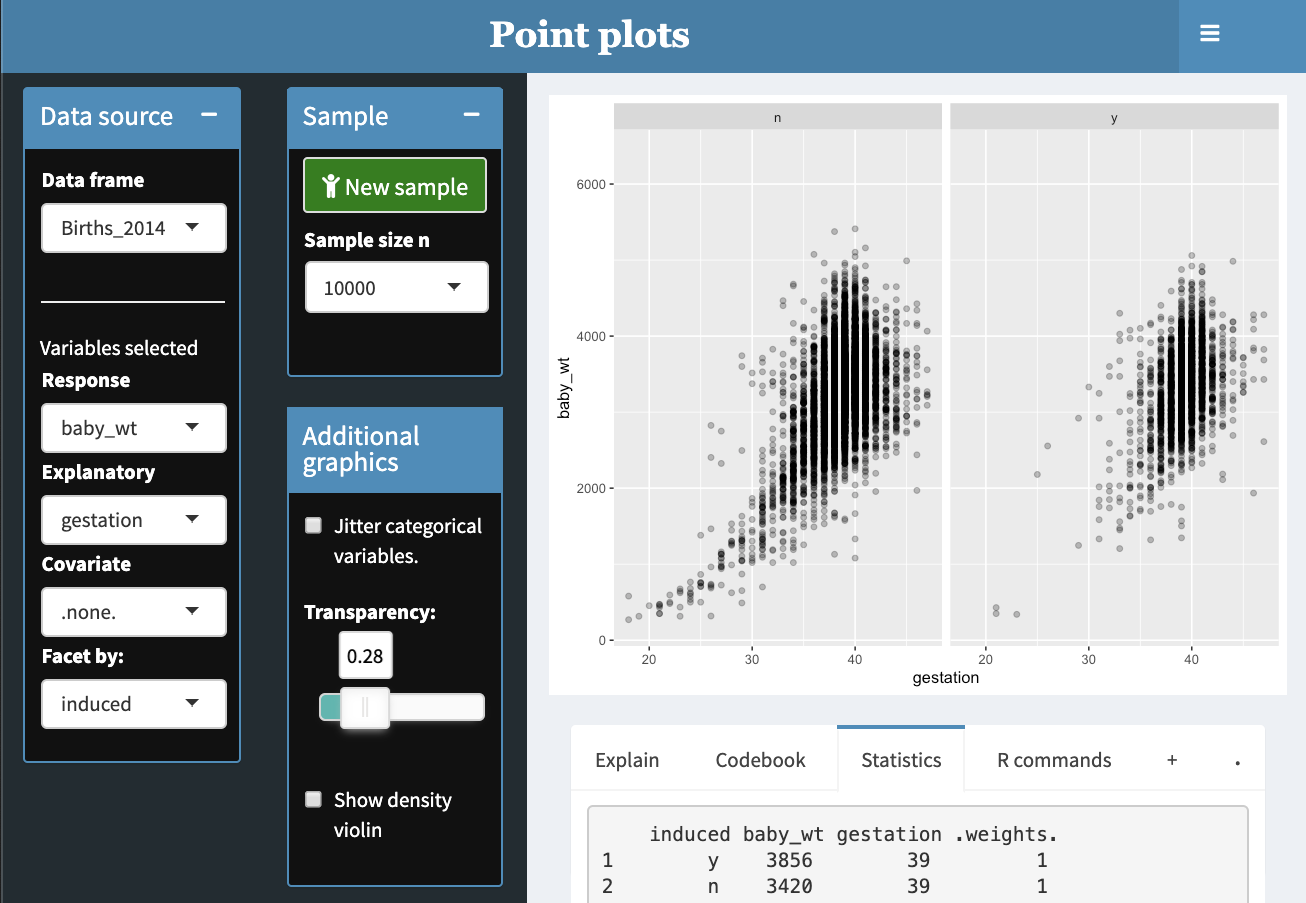
The point-plot Little App provides a quick path to making data graphics. Select the data set, the response and explanatory variables, and you’re there.
- You can map color to a covariate and can facet the graph (as shown above) by another covariate.
- Works with both quantitative and categorical variables on either or both axes, for color, and for faceting.
- Can jitter categorical variables
- Set transparency to handle overplotting in large data sets.
- Can overlay violin density plots. (Quantitative variables are divided into 3 groups for this, color, and faceting.)
- Has a measurement ruler.
Suggested StatPREP 101 activities
comments powered by Disqus