June 3, 2017
The Grammar of Graphics
The title comes from Leland Wilkinson’s book, The Grammar of Graphics

The first chapter is quite mathematical – give it a look by following the link above.
One purpose was to give a way of describing graphics in the face of a combinatorial explosion of designs.
- How to describe graphics to the computer for drawing.
But it also provides a way for teaching graphics.
Frame
Sets the meaning of the drawing space.
- For stats, x-y coordinate frame suffices … almost!
- axes can be quantitative or categorical
- for categorical axes,
- there’s space between the positions marking the levels
- we can use this interstitial space to various purposes
- random scatter (jitter)
- dodging (side-by-side), stacking (on top of) incorporates a third variable
- Facetting to incorporate a third/fourth/fifth variable
StatPREP guideline:
- All aspects of the frame should be mapped to variables!
- The vertical axis should always be the response variable.
Assessment items:
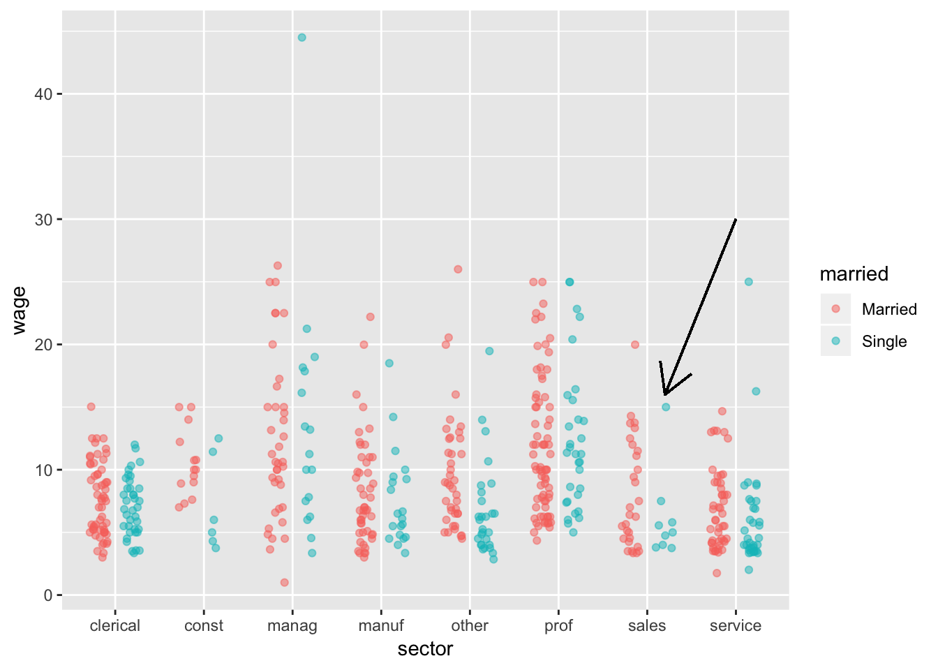
- How many scales are there?
- Which variable is mapped to each scale? Is that variable continuous or discrete
- What variables are displayed by the position of the indicated point?
- What does each dot correspond to in the real world?
- What’s the sex of the person at the indicated point?
- For categorical scales, what property sets the order? Is it meaningful?
- Should zero be included on the vertical axis? Why or why not?
Glyphs
Glyphs are the individual data marks in the frame. Each layer consists of glyphs of the same type. They have graphical properties (“aesthetics” in the grammar):
- shape
- color
- size
- transparency (alpha)
- position
- and so on
Assessment item:
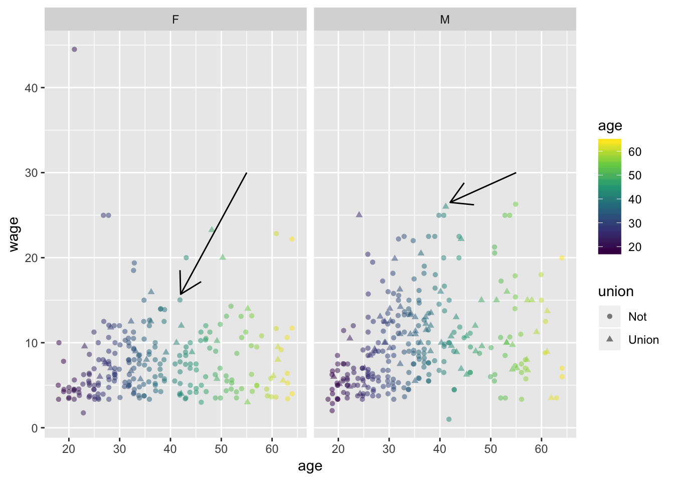
- How many variables are represented by position?
- How many aesthetics are there? (Include x- and y-position in your count.)
- How many variables are represented?
- Which variable is represented in more than one way? Name the variable and say what the different ways are.
- What are the values for the variables at each of the indicated points?
- Keeping the same frame, how can you change the graph to keep all the variables but make it clearer how union membership relates to wage?
Layers
A graph consists of a frame and one or more layers.
StatPREP guidelines:
- ALWAYS include a data layer
- Statistical objects (if needed) should be represented as additional layers.
- It’s helpful to consider including two distinct types of layers for statistics:
- Interval layers
- Density layers
- It’s helpful to consider including two distinct types of layers for statistics:
Interval layers
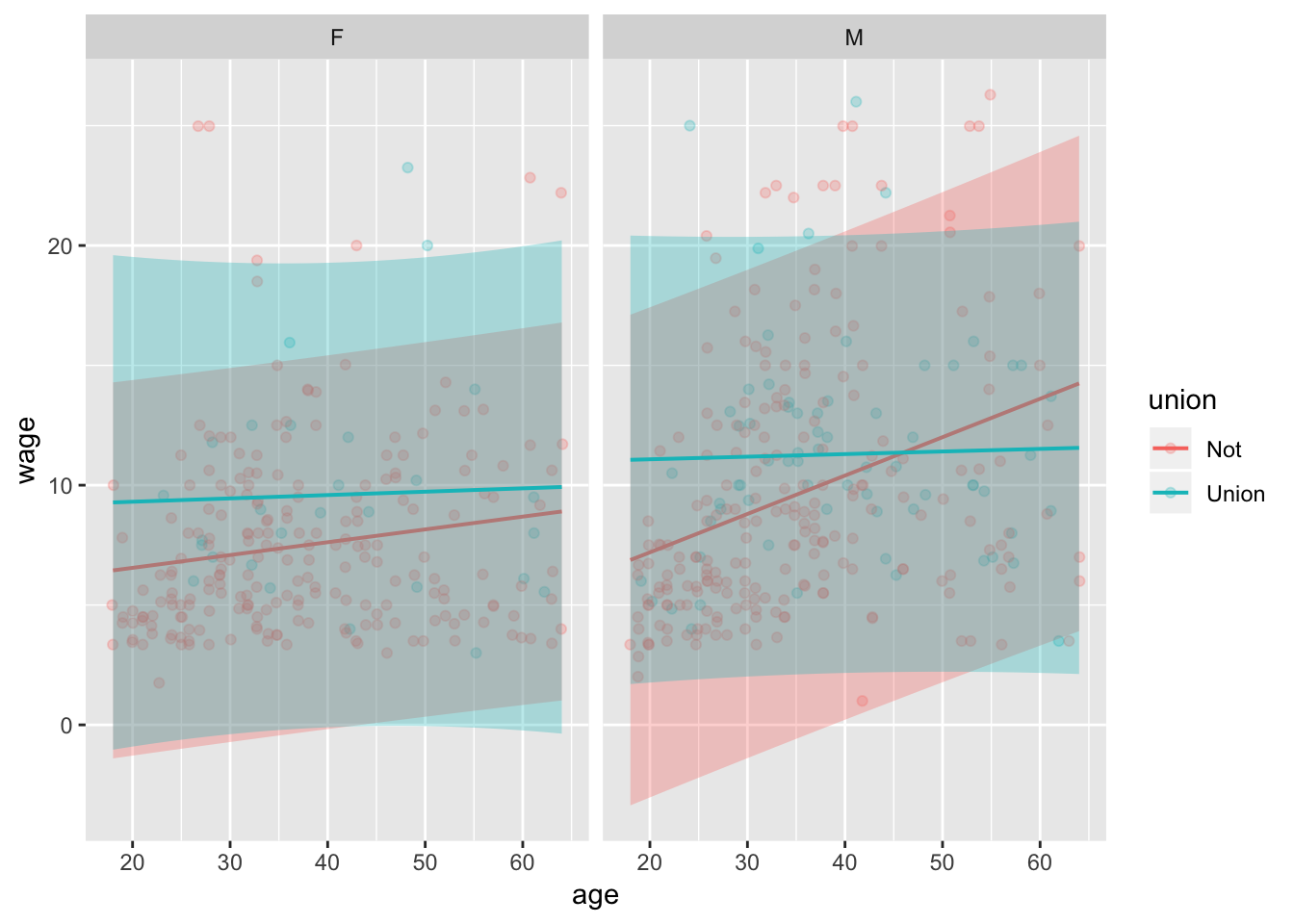
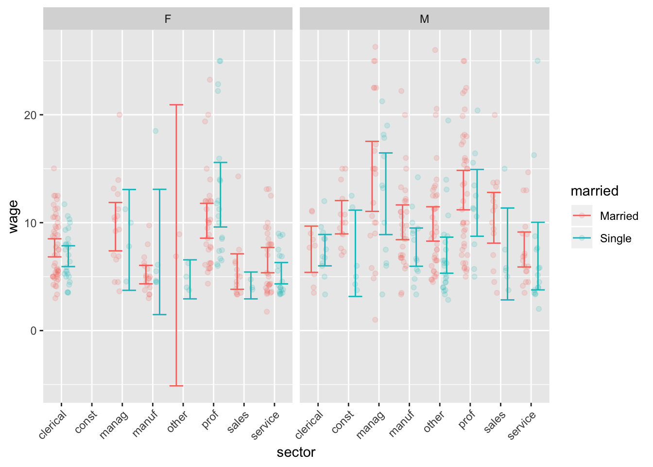
Some assessment items:
- One of the graphs shows a prediction interval, the other a confidence interval. Which is which? Explain what you saw in the graphs that led to your answer.
- Which, if any, of the employment sectors show a statistically significant wage difference between married and unmarried workers?
- How would you re-arrange the graph if you wanted to examine sex-related differences in wages?
Density layers
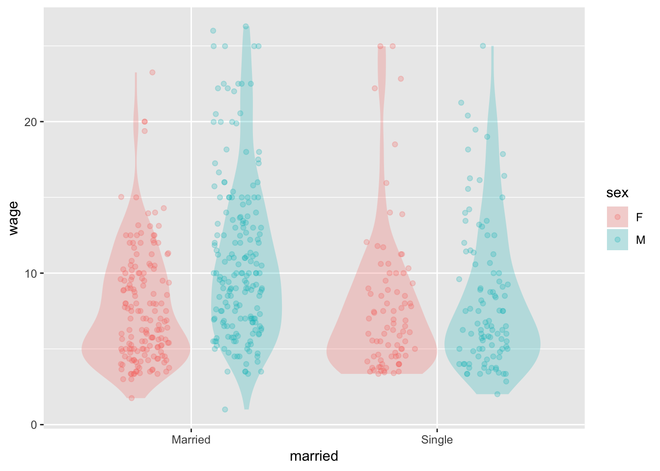
Assessment items:
- Are wages approximately “normally” distributed?
- The “glass ceiling” describes a phenomenon where women tend not to rise as high in employment as men. What about the graph is consistent with the glass ceiling?
Point out alternatives
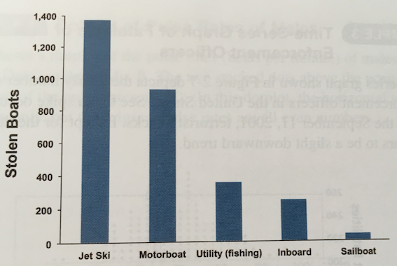
- What determines the order of the categories on the horizontal axis?
- Is a jet ski more likely to be stolen than a sailboat? How can you tell this from the graph?
- What does the data frame look like on which this graph is based?
- How many variables are there in the “raw” data? What is the unit of observation? (Ans: A stolen boat.)
- Suppose you are working for a boat insurance company. You want to figure out what are the risk factors for a boat being stolen.
- What variables would you select from the company’s database? (e.g., Is it trailable?)
- What would be the unit of observation? (Ans: A boat)
